Zenkai is now live
We’re excited to announce that Zenkai is officially live! After years of wrestling with the age-old problem of “is this chart wiggle meaningful or just noise?” we’ve built something that finally gives you a clear answer.
If you’ve ever stared at a dashboard wondering whether that drop in conversions was a real problem or just Tuesday being weird, you know exactly why we built this. Most analytics tools show you the what—Zenkai tells you the so what.
No signup needed
We want you to reach that “aha!” moment with your own data as quickly as possible. You can upload your metrics and generate XmR charts immediately without creating an account.
This isn’t a growth hack—it’s our genuine belief that the best way to understand whether Zenkai solves your problem is to let you actually use it. The product should speak for itself through your own data discoveries.
The real test: your actual data
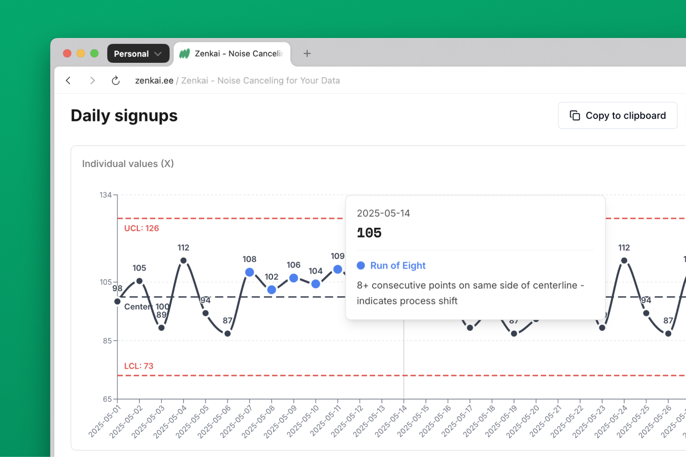
Paste your data directly into Zenkai and watch as it generates an XmR chart that reveals what’s actually happening in your metrics.
Whether you’re tracking conversion rates, customer satisfaction scores, or operational metrics, you’ll finally know when to investigate a change and when to let your process run naturally. No more chasing false alarms or missing real opportunities.
Insights that don’t require a statistics degree
Understanding what your chart means shouldn’t require you to remember college statistics. Our insights panel explains your data story in plain English, automatically detecting which changes are significant and which ones are just routine fluctuations.
You get clear explanations like “Your conversion rate on March 15th was unusually low and worth investigating” or “This week’s signup numbers are within normal variation—no action needed.”
Pre-loaded examples that actually teach
Not sure where to start? We’ve included several real-world datasets that demonstrate different types of signals and patterns. These aren’t toy examples—they’re actual business metrics from various teamsthat show you how XmR charts reveal insights traditional dashboards miss.
Each dataset tells a story:
- Product teams drowning in support tickets — See how to distinguish between normal launch noise and actual product fires that need immediate attention, so you stop chasing false alarms every release
- Marketing teams explaining traffic fluctuations — Learn to separate seasonal patterns from campaign performance, so you can finally prove (or disprove) whether your marketing efforts are actually working
- Growth teams tracking signup volatility — Discover how to filter out weekend dips and holiday spikes to see real growth trends, so you know when you’re actually growing versus just riding natural waves
- Founders stressed by monthly revenue swings — Understand what’s normal variation versus genuine business changes, so you can sleep at night instead of panicking over every monthly bounce
Built on 90+ years of proven methodology
XmR charts aren’t some new Silicon Valley invention—they’re a battle-tested statistical method developed during World War II for manufacturing quality control. We’ve simply made them accessible for modern business metrics.
The math is sophisticated, but the application is beautifully simple. When Zenkai shows you a signal, you can trust it’s worth investigating. When it doesn’t, you can focus your energy elsewhere.
Learn more from our documentation: https://zenkai.ee/docs
Other features
- One-click chart exports as high-resolution PNG files
- Built-in help system explaining XmR methodology without the academic jargon
- Automatic data validation with helpful error messages for common formatting issues
- Secure data handling—we don’t store your sensitive information